Cafe Studio.
Concept Project / Studio DemonstrationThree ways to feel right at home.
THE EXPLORATION
Same purpose.
Different personalities.
Explore how a cafe website can express its personality while making everyday tasks feel effortless: finding the menu, planning a visit and trying a table-booking experience.
We developed three distinct visual identities around shared application logic. Each has its own typography, content priorities and editorial rhythm, with the same care given to mobile menus, navigation and forms.
An original studio concept, not a paid client commission. The three cafe brands and their business details are fictional. The reservation flow is a demonstration; no real booking is taken.
DIRECTION 01 / QUIETLY CONSIDERED
Specialty Coffee
Studio Coffee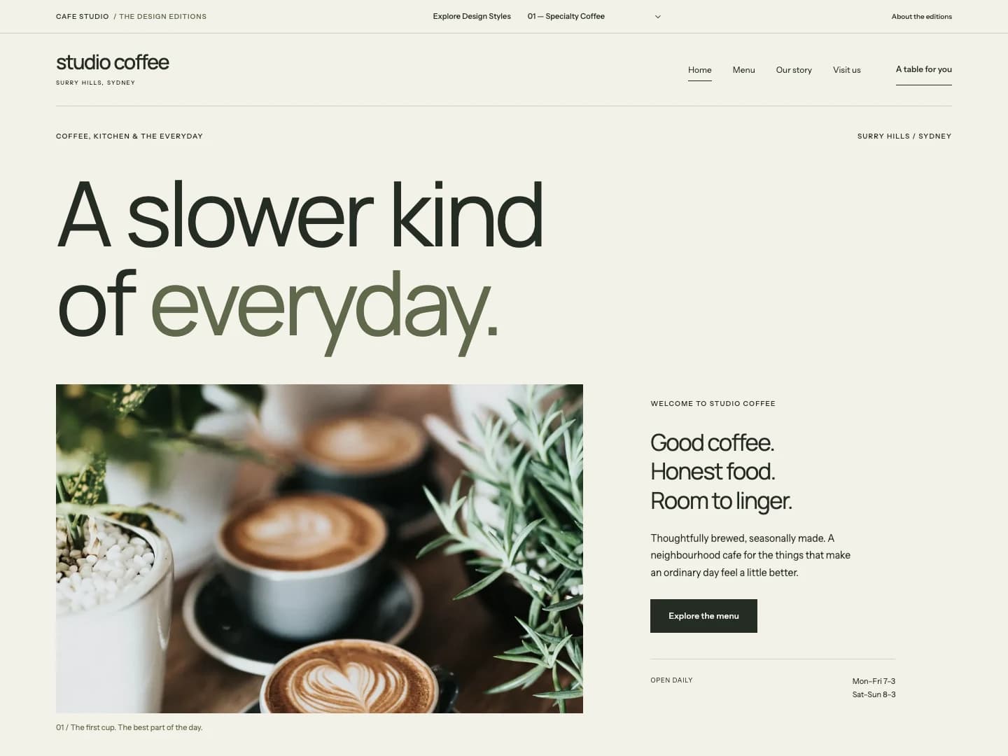
THE POINT OF VIEW
A slower kind of everyday.
An editorial identity for a coffee-first neighbourhood cafe. Precise typography, generous space and a menu that puts the daily ritual first.
A restrained grid, a muted olive palette and a ruled coffee index bring a sense of care to simple, practical actions.
- Typography
- Manrope / Instrument Sans
- Focus
- Identity, clarity & everyday usability
Choose “Specialty Coffee” in the demo’s “Explore Design Styles” control.
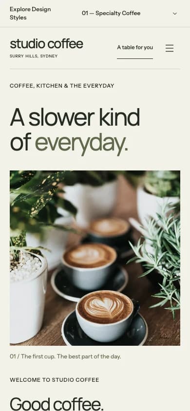
A MOBILE COMPOSITION, NOT A SHRUNKEN DESKTOP.
DIRECTION 02 / A LITTLE MORE EXPRESSIVE
Brunch & Lifestyle
Studio Days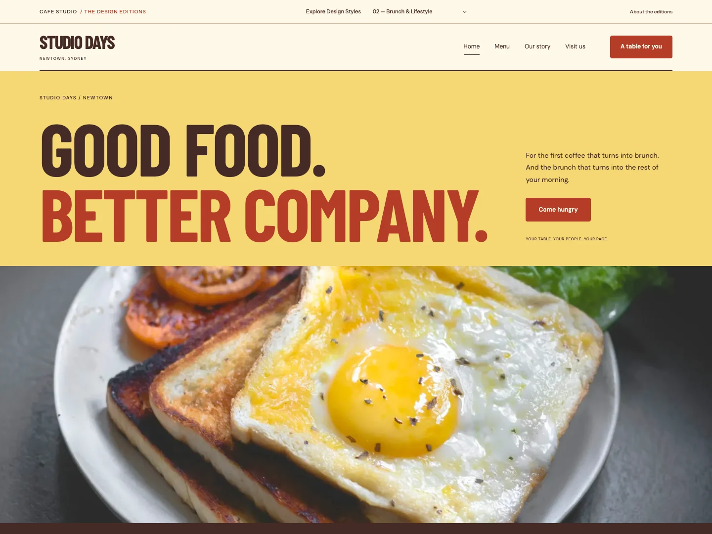
THE POINT OF VIEW
Make a morning of it.
A brighter direction for long breakfasts and shared tables. Expressive type and generous food imagery meet an approachable, practical menu.
Condensed display type gives the brand energy while open reading text keeps menus and booking forms easy to use. Warm colour fields create a different pace.
- Typography
- Barlow Condensed / DM Sans
- Focus
- Identity, clarity & everyday usability
Choose “Brunch & Lifestyle” in the demo’s “Explore Design Styles” control.
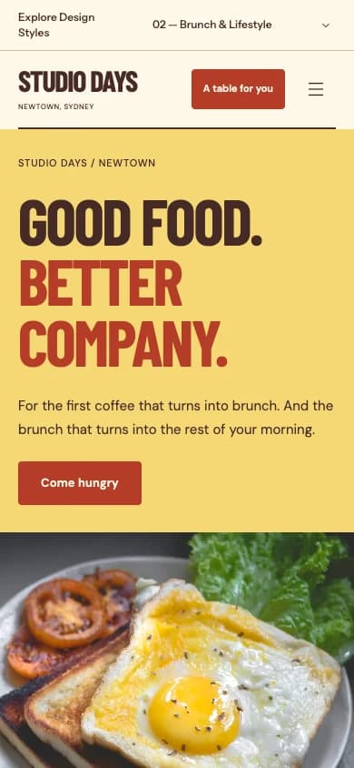
A MOBILE COMPOSITION, NOT A SHRUNKEN DESKTOP.
DIRECTION 03 / MADE WITH A LITTLE PATIENCE
Artisan Bakery
Maison Studio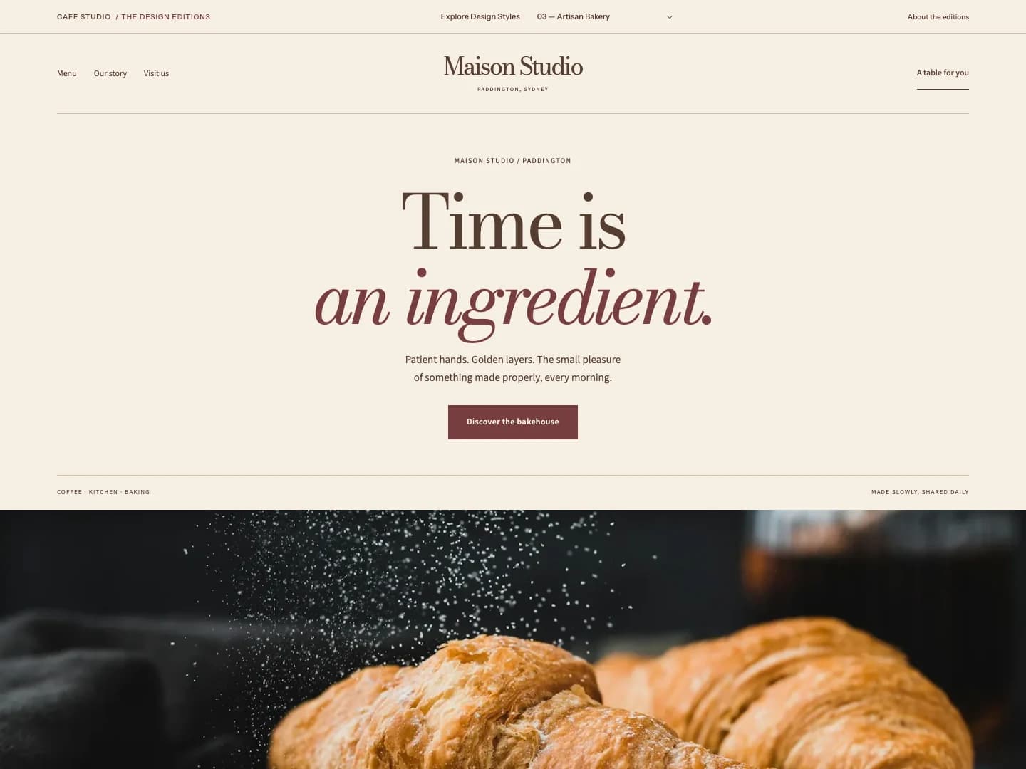
THE POINT OF VIEW
Time is an ingredient.
A warm, serif-led bakehouse journal. Photography of crust and layers sits beside thoughtful type, fine rules and an unhurried composition.
A centered typographic introduction and a typeset counter list let the craft lead. Mobile pages keep the menu and reservation controls within easy reach.
- Typography
- Bodoni Moda / Source Sans 3
- Focus
- Identity, clarity & everyday usability
Choose “Artisan Bakery” in the demo’s “Explore Design Styles” control.
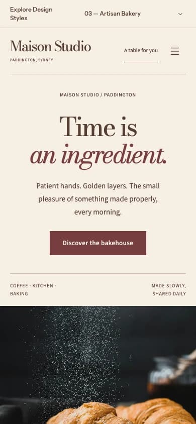
A MOBILE COMPOSITION, NOT A SHRUNKEN DESKTOP.
THE DETAILS THAT MAKE IT WORK
A good first impression.
A useful next step.
Menus that can be searched and filtered. Clear visit information. A keyboard-accessible mobile menu. A clearly labelled reservation demonstration. The concept pairs personality with practical customer journeys.
Original screenshots captured from the existing live concept.
No client results, commercial outcomes or awards are claimed.
SOMETHING IN MIND?
Have a good place?
Let’s give it a
good website.
START A PROJECTA considered website. A straightforward process.
One-off projects, scoped to your needs.